Based on the comprehensive list of notifications, here’s a suggestion for improvement (or at least a start)… As you’ll notice there is a lot question marks and things left to be discussed, so consider this a draft. This scenario includes features that are not yet released, like store conversations, store subscriptions and @ mentions.
Types of notification
The existing types below show the where the user gets or see them, so we should pay attention to how the context is connected to the relevance or importance of what is being notified, hence the comments of what it should be used for.
-
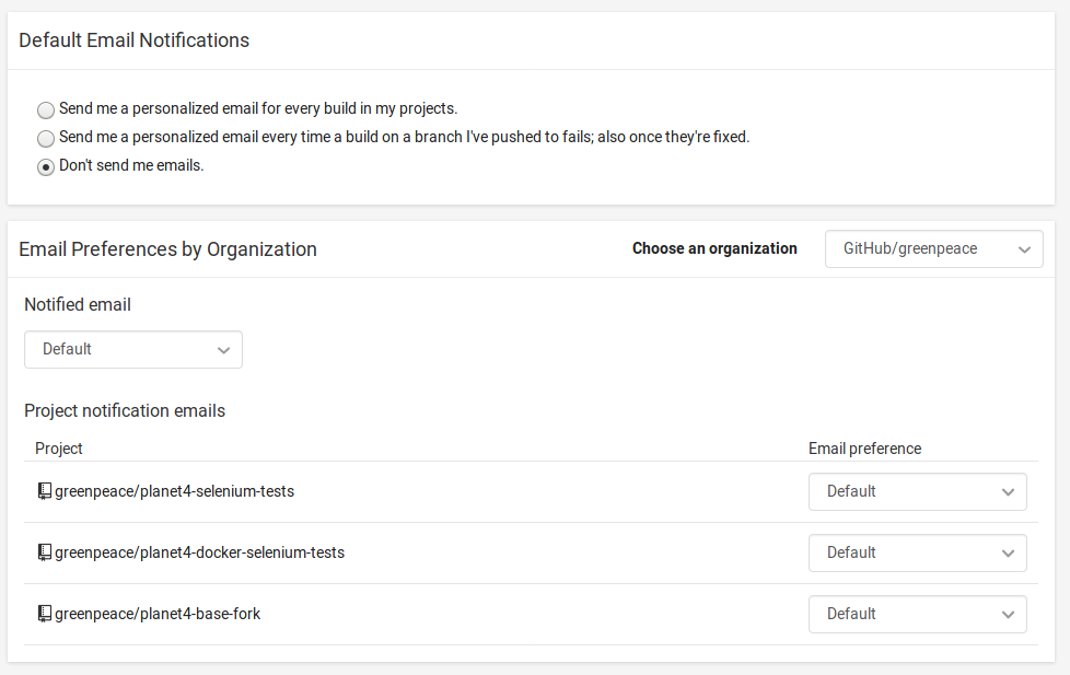
 E-mail notifications: for the most important messages and events that the person does not want to miss. All of them should be easily turned on and off, as a whole or individually.
 -
 Bell notifications: for different messages and events in the group that can be of relevance to the person. Some, but not all, can be set on and off by the user.
 -
 Chat notifications: for all the chats that the person has actually participated in, has a mention or has subscribed to.
 - Push notifications (browser and mobile): follows the same behaviour of all the above combined? Not sure about this one…
How each notification should behave
-
Group wall messages (
, , push) – on by default in bootstrap mode, when the group is starting. Off by default later (after how many users, or how many active store conversations?). Can be muted with a link on the e-mail itself and on the settings page. -
Replies on threads that you are part of (
, , push) – on by default, can be turned off individually or on settings page (only for e-mail) -
Private messages (
, , push) - on by default, can be turned off individually or on settings page (only for e-mail) -
Pickup chat (
, , push) - on by default, can be turned off individually or on settings page (only for e-mail) -
Store conversation (
, , push) - on by default on subscribed store, can be turned off on settings page only for e-mail or by unsubscribing store -
Available upcoming pickups (
) - on by default, can be turned off on settings page -
New applications (
, ) - on by default (on bootstrap mode only, again to be defined what that may be, in this case number of users makes sense), can be turned on/off on settings page (e-mail and bell) -
Application chat (
, , push) - on by default only on chats that one participates, can be turned off individually or on settings page -
You application has been accepted (
, ) - on by default, cannot be turned off -
Someone joined your group (
) - on by default, cannot be turned off -
Someone accepted your invitation to join the group (
) - on by default, cannot be turned off -
Your upcoming pickups (
) - on by default, cannot be turned off -
Pickups you joined have been edited (
? ) - on by default, cannot be turned off -
Give feedback reminder (
) - on by default, cannot be turned off -
Someone gained editing rights (
) - on by default, can be turned off at settings page -
Store has been created (
) - on by default, can be turned off on settings page -
Weekly summary (
) - on by default, can be turned off at the settings page for e-mail notifications
UX improvements
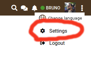
I’ll start with the most obvious (from usability tests). Finding the notification settings is very unintuitive. My suggestion is to take away the settings button next to “Home” and move it up to the header, either like this…
or like this, with the icon at the top of each drop-down for the chat and bell notifications…
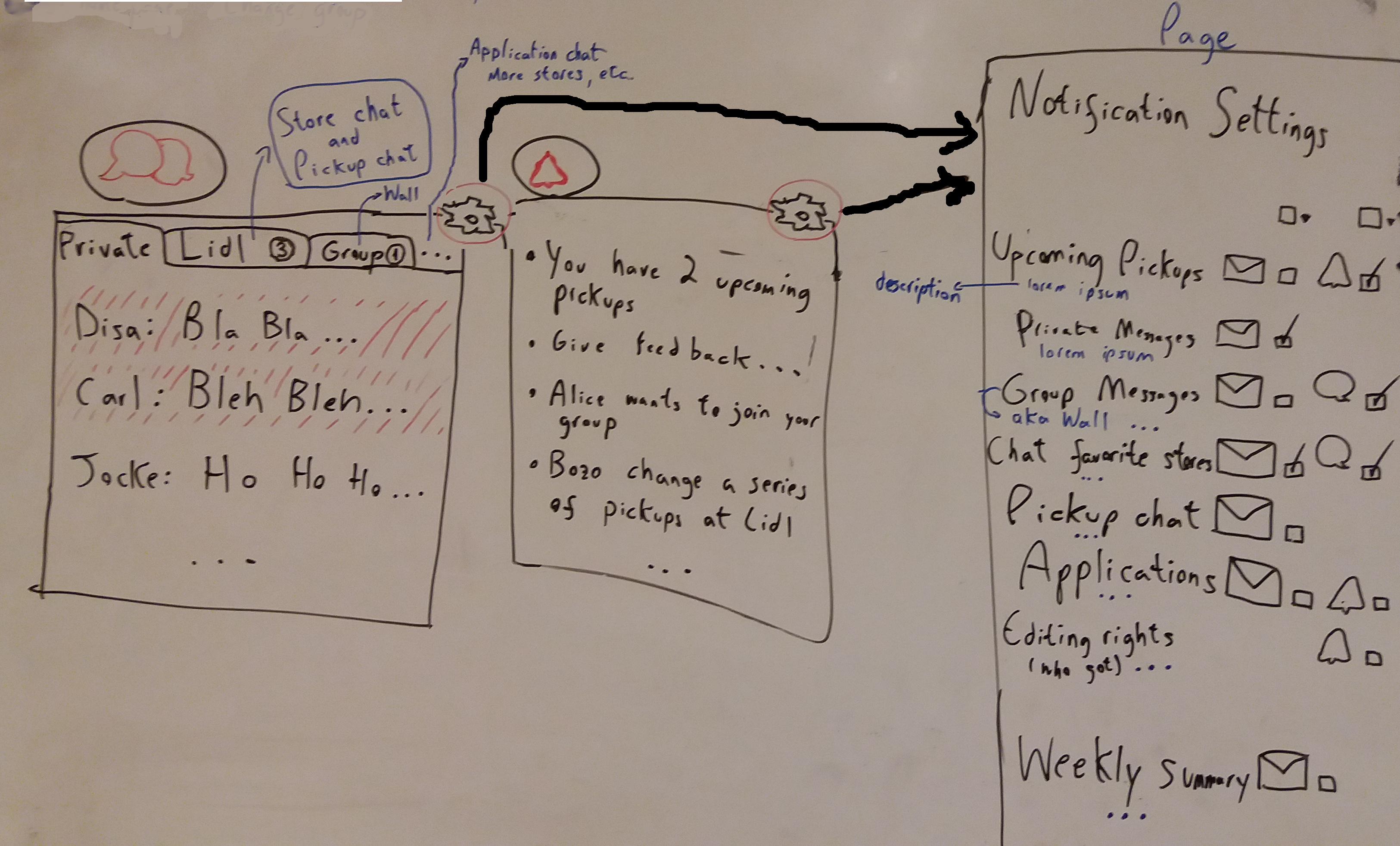
The image above shows other suggestions too:
- how the chat notifications can be divided in tabs, like private messages, group wall messages and replies, store conversations and application chats. The context of the messages/chats becomes a bit clearer with this division.
- how the notification settings page could be more detailed
Another easy improvement is to be coherent with the notification icons, by either taking away completely the big bell icon attached to the wall that enables/disables e-mail notifications or changing it to another icon like . The same goes for the bell icon attached to each individual conversation.
Well, that was a long list!  But I hope some of it can be useful