I agree that showing the store description is important. I originally wanted to have it so that it always shows the first 3 lines and can be expanded if necessary. That would encourage people to put the most important information first. But it was simpler to add a collapsible, so that’s why it’s there…
About the location of the tabs: it felt wrong when clicking the tab, the content below would keep the same. If you have long store descriptions that move tabs down, it could seem that tab content doesn’t change at all - at least to users with smaller screens, their whole screen is occupied by description.
I moved the buttons to have a indicator which page the user is on. If I would have kept the top right buttons, then on those pages I would either show the tab bar without any tab selected or not show the tab bar.
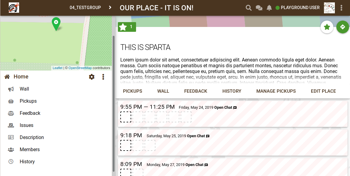
You might have noticed that the topbar breadcrumb now always shows the store name. That should make it much easier for mobile users to recognize the context. Before, it would only say “Edit store”.
Talking of keeping “risky” buttons separate - the “star” and “route” buttons are one of the least risky ones and most users would want to click them, so I don’t see an advantage in either of those locations.
I briefly thought about having a “vertical dot” menu at the end of the tab bar for those two pages, but then we would also lose the active page indication.
With that in mind, would you still propose the changes?
We prefer the navigation buttons to be at the top, above the description.
This concern does not seem to be very worrying. With navigation buttons below the description it’s not very convenient too. When description is long I have to scroll down to find the buttons. When I click on one of them, the page changes and scroll is back at the top which means I have to scroll down again. Moreover, if description can be collpased, your concern can be mitigated by collapsing a long description. Then, the content of the page will change.
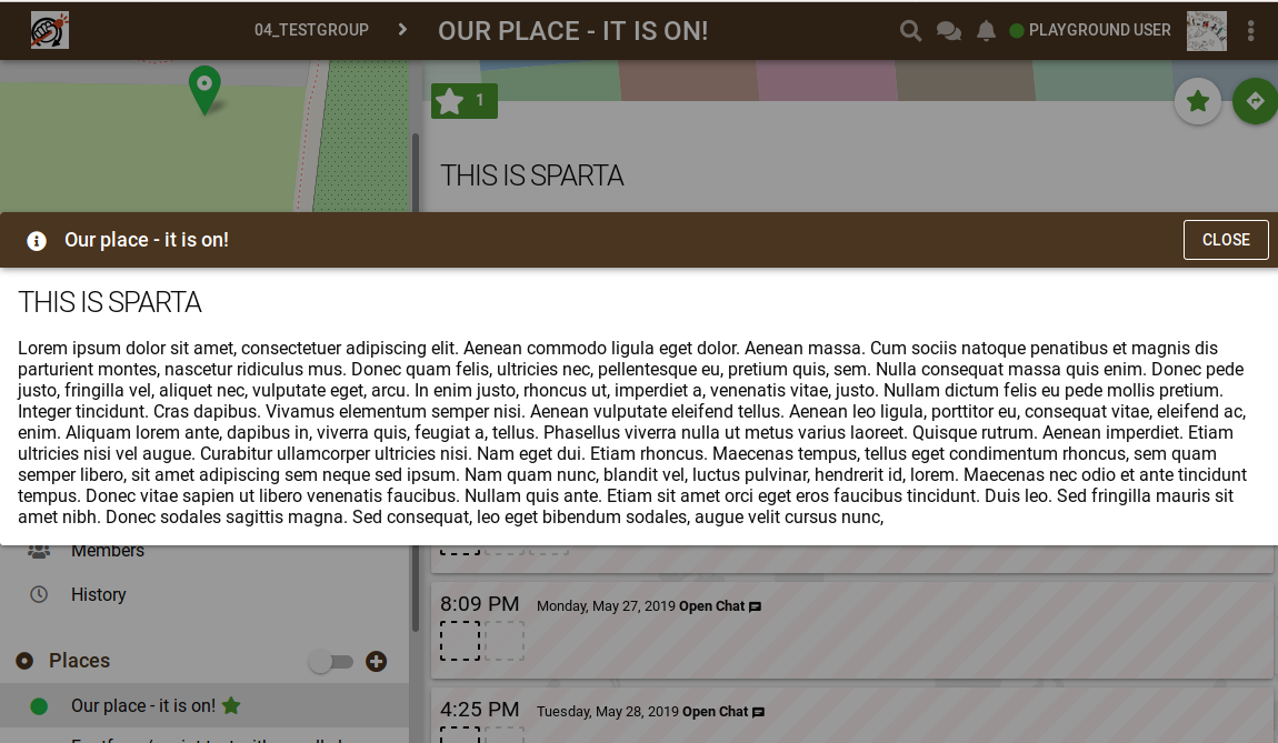
We would like to display collapsed description in a nicer way. Currently it only shows one row and it shows markdown notation - it’s not formatted. It doesn’t look nice and because it’s only 1 line, it can’t really be used to display the most important information on the store.
I see many benefits of having a possibility to collapse and expand the description, especially when it’s very long and I’m already familiar with its content. Therefore, I wouldn’t like to get rid of this feature. The most important request from our group was to have navigation tabs at the top. Collapsed description could be a bit nicer too but this is just a nice-to-have feature, rather than a must-have one.
In our group for some stores we hava a link to a longer description about how the pickups are done on our website. That works kind of like a way to collapse a long text.
The store description on karrot is information that you want especially new foodsavers doing their first pickup in the store to read before they sign up like who is the contact person, what transportation do you need, if you need to call someone in the store before every pickup/if a pickup gets cancelled, where do you deliver the food.
Since a long time I have problem with unneccessary notifications, but onbly today I was motivated to write about it. Does anyone else experience this problem too? I have no stars, so I should be getting only the main wall notifications, but I’m getting also other ones for the specific stores. I tried to star them and unstar them, but it didn’t help. Please, move the topic elsewhere if it’s not the best place for it.
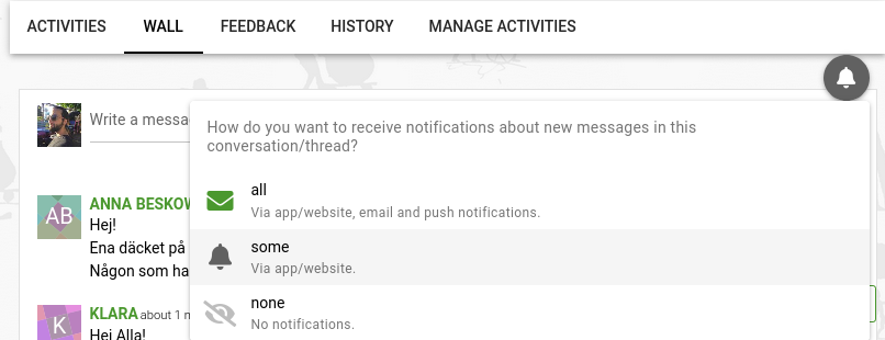
The star icon on the notification is a bit misleading, since you’re not receiving them because you marked the place as favorite. I would guess that at some point you wrote something on the place wall, and that turns on the notifications for that specific wall. Check what the icon is if you go a place/store that you’re getting notifications from and then its wall, on the top right:
If that’s the case, it solves the problem for now. But then we should probably question whether notifications should be turned on for specific place walls whenever we write something there. What do you think?
Oh, you mean the envelope on the wall with messages? Wow, this was difficult to find and I wouldn’t find it without your help. So I would say that it’s absolutely not intuitive. I think that the star should do all the job and the notifications shouldn’t be on when writing something in the wall.