Hi! First time posting so I hope I got the categories and everything correct.
I’m working with Bruno on testing Karrot with the Bike Kitchen, among other things, and I had some ideas to improve the usability. What mainly bothered me was the difficulty in figuring out where I was in the navigation. I much prefer discussing UX design with concrete examples to reference to, so I made a little mockup in html+css to share my ideas. Please don’t mind the colour scheme as it’s just to show contrasts rather than making it look pretty.
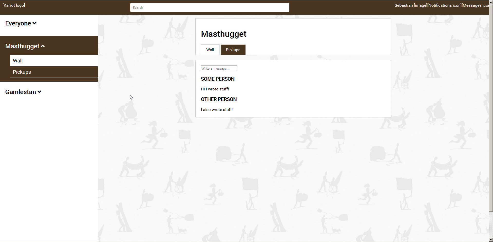
Navigation is both on the sidebar and on the page itself, trying to use tabs as much as possible (they’re usability magic). “Masthugget” and “Gamlestan” are Bike Kitchen locations, which in Karrot’s case are counted as “stores”. It reuses a lot of the existing design, but clarifies where the user is in the navigation hierarchy through highlighting in the sidebar with colours.
The top menu bar is simplified according to what I’ve seen people use the most in Karrot. The order of the buttons of the right side of the bar is wrong, so don’t mind that. The “switch language” and “updates from food saving community” were removed, since they’re rarely used.
I hope this is helpful for the discussion on Karrot development. I’ll try to find time to answer questions on the mockup if there are any, maybe make another mockup if I find the time.
3 Likes
Hey @Niwsters, cool to see you here! 
First of all, thanks for your work! 
Now to some specifics: To me it seems that the biggest changes are the color highlighting in the sidenav and the removed buttons in the topbar, is that right? The tab navigation inside stores is good - but isn’t it already in place? So is your proposal in this regard more about making them more visible and/or also highlighting the current tab by color?
I see that you also removed the category names in the sidenav, so that now the stores are listed below each other and - I guess - the first one in that list is the group wall?
What about the removed buttons from the topbar? I guess the language switcher would go to the profile page somehow, but what about the community updates, do you plan on simply removing them completely?
Now the last question: This seems to be only about desktop layout, did you think about mobile layout as well?
1 Like
Tried to reply last week but had my password on another computer. That is now fixed, so here goes!
The main difference is that the sidebar matches the tabs, and that the sidebar shows all the group-specific links that currently only the tabs show. For example, currently, when you click on a store, you see two links: “Wall” on the sidebar and “Wall” on the tab, but they both point to different walls. I want the sidebar to function as a form of map that tells you, “you are here, and here are the places you can go.” It partly does that right now, but I find it too easy to mix up the group-specific links with the store-specific links.
I see that you already moved the buttons in the topbar (yay!), so I’ll just assume we thought the same on this.
I’ll try to have a look at the mobile layout as well. Haven’t done so yet as I am forcibly stuck with an old iPhone.
1 Like